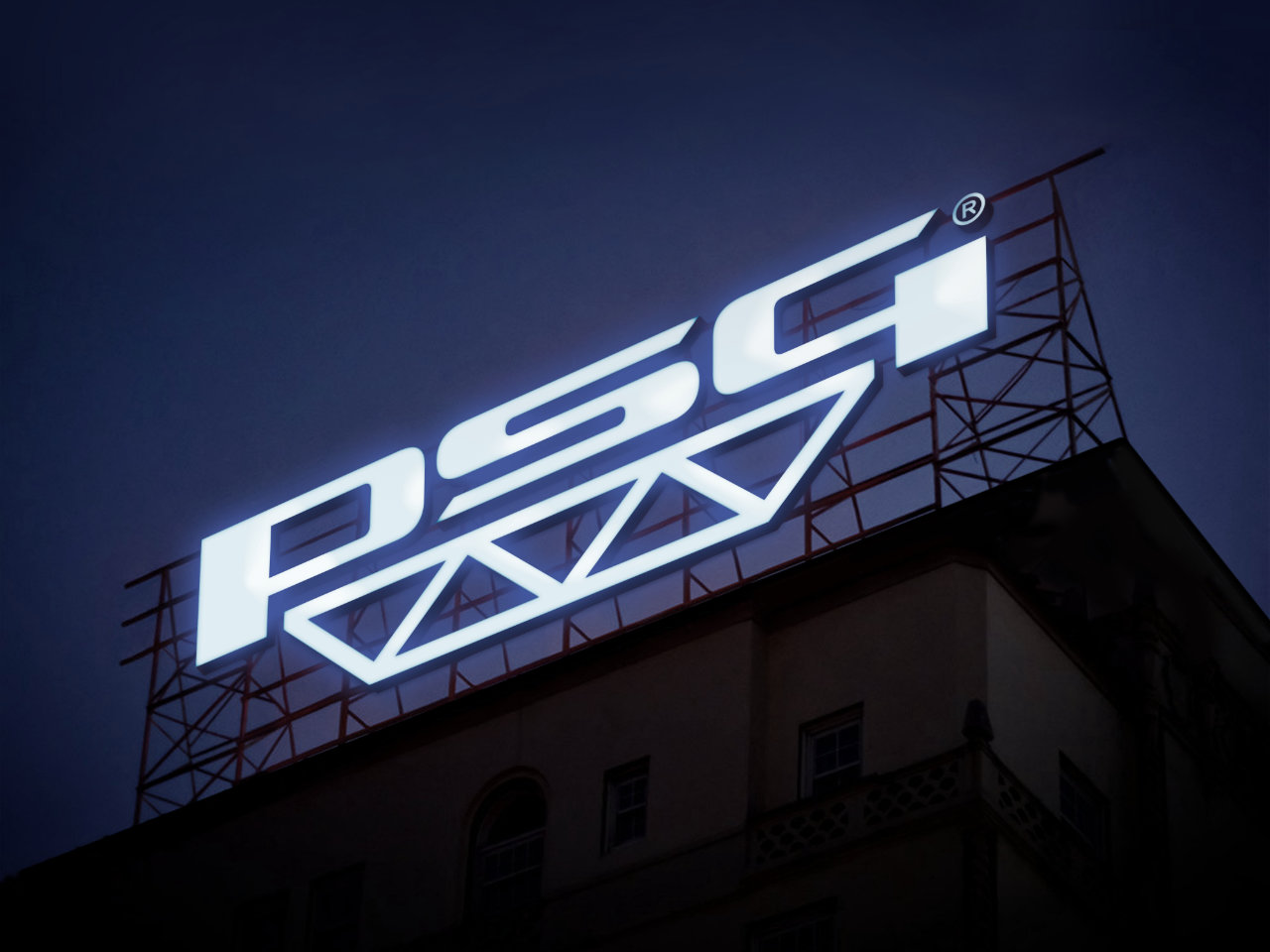
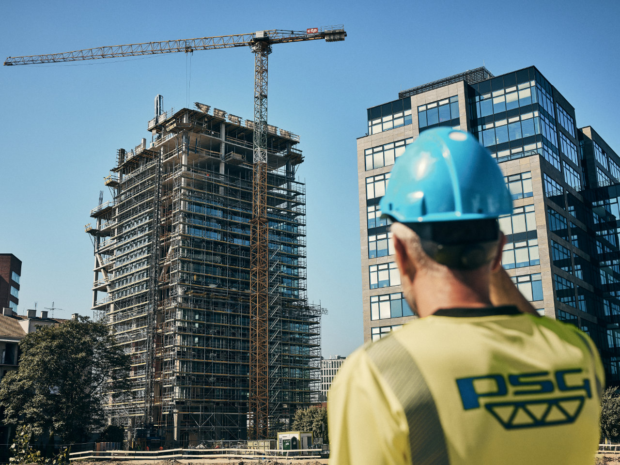
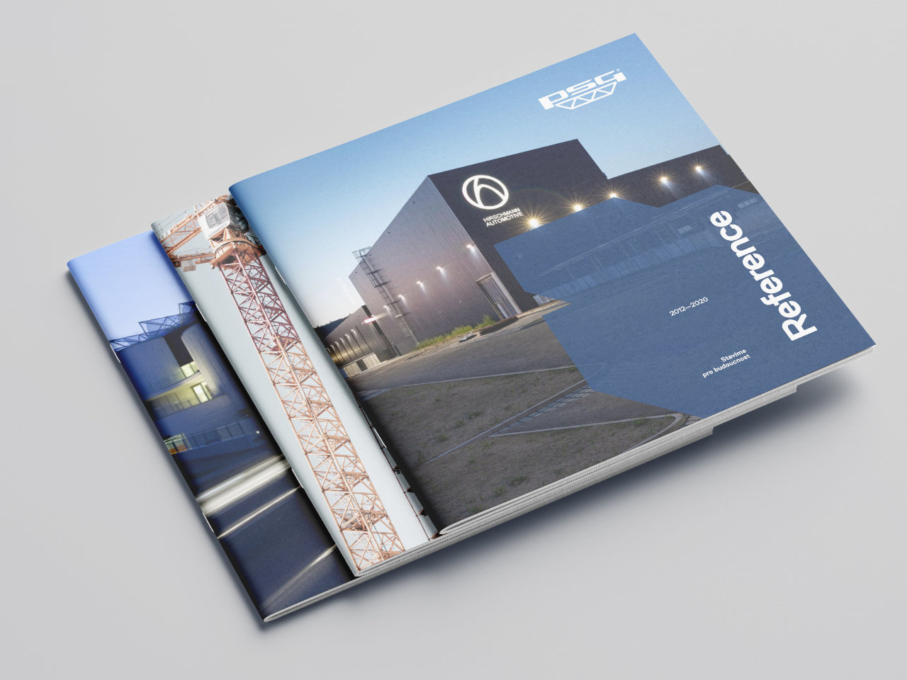
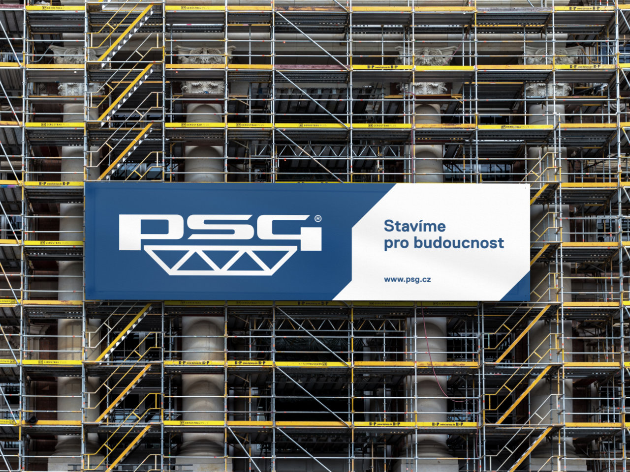
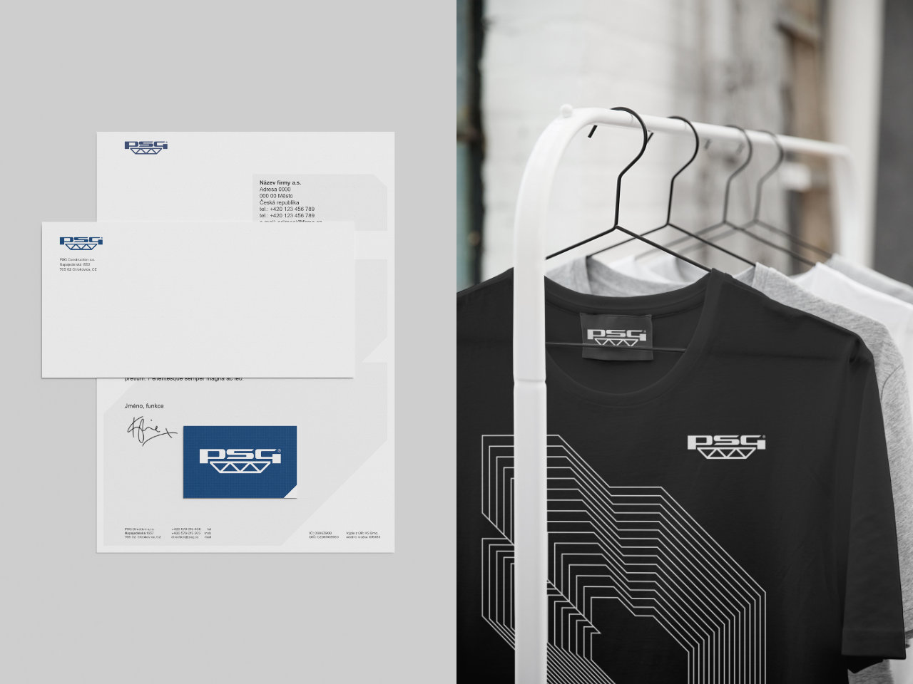
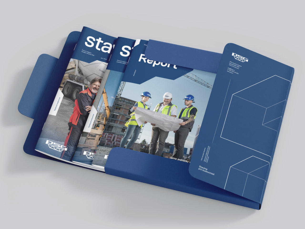
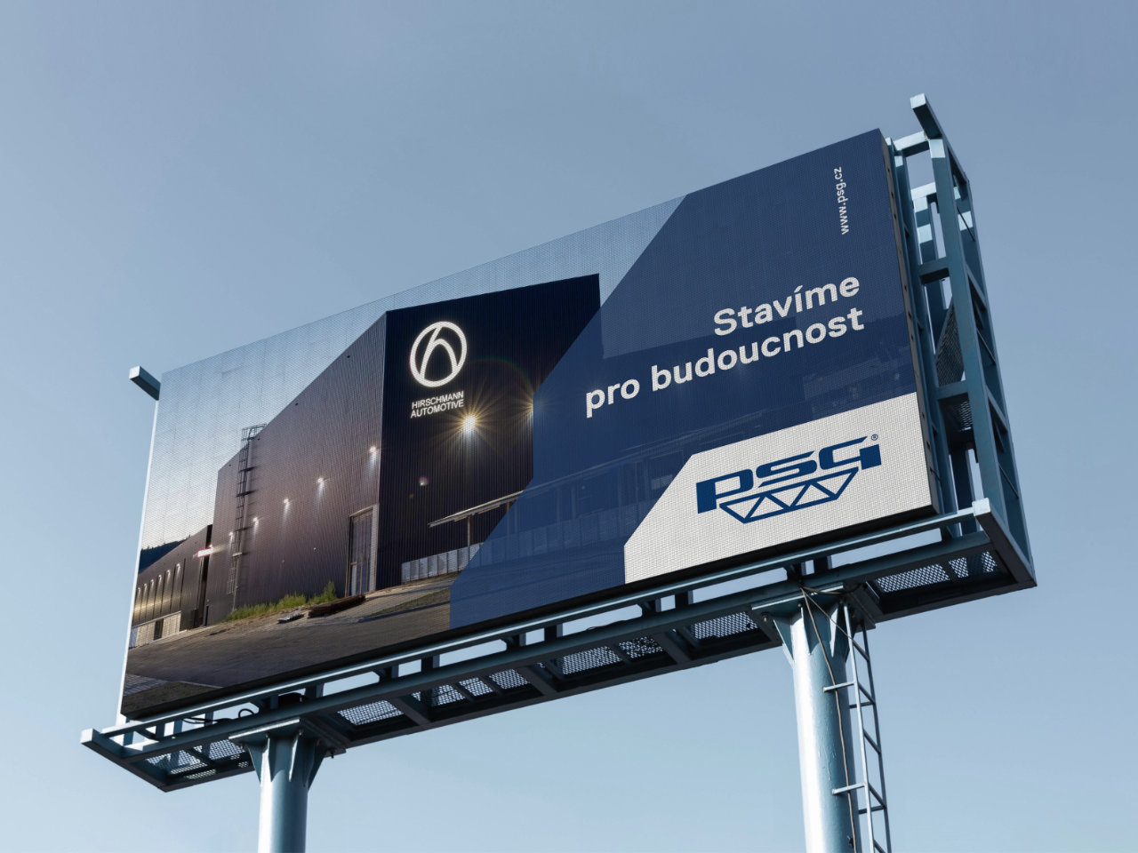
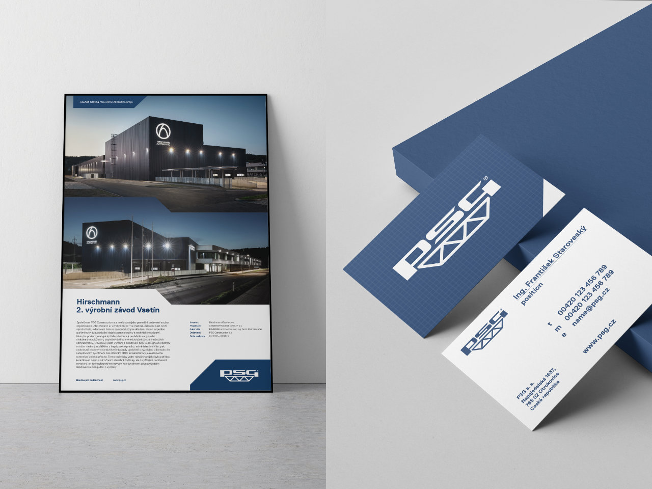
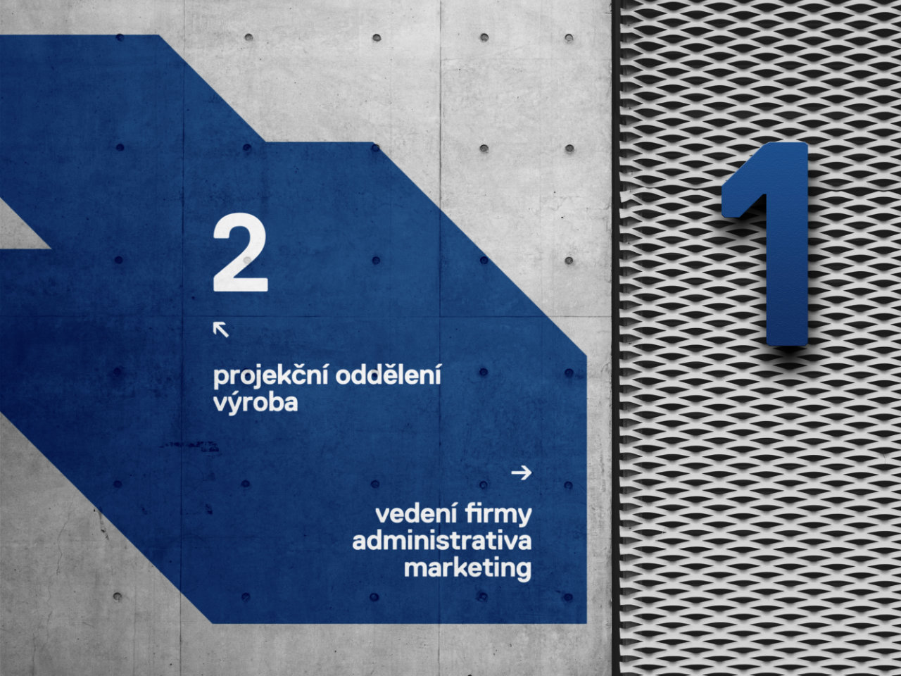
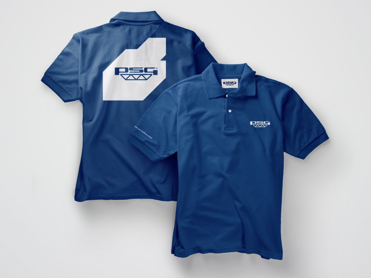
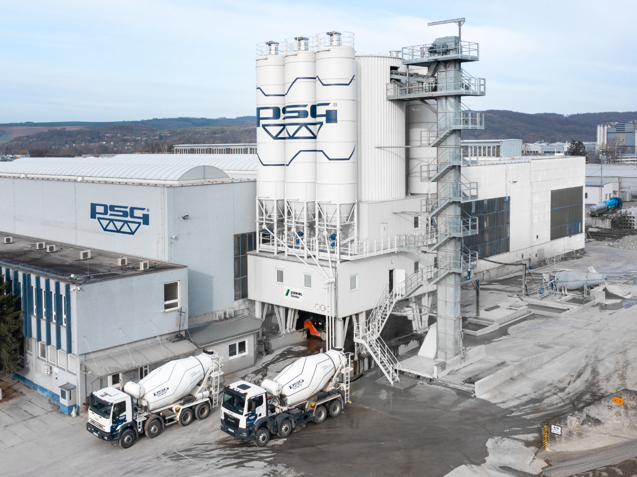
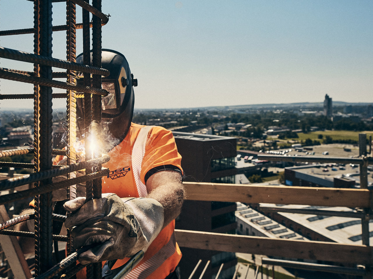
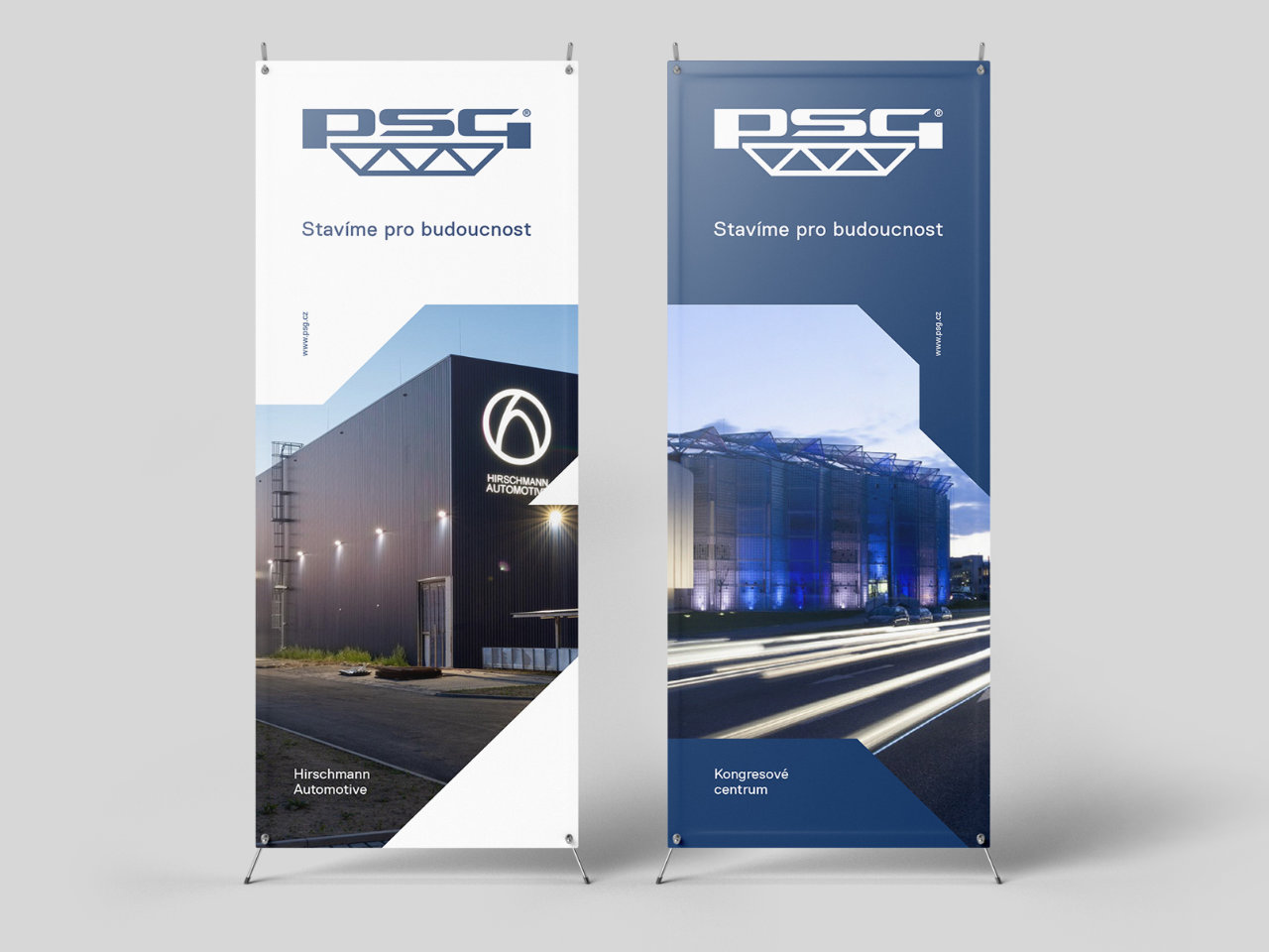
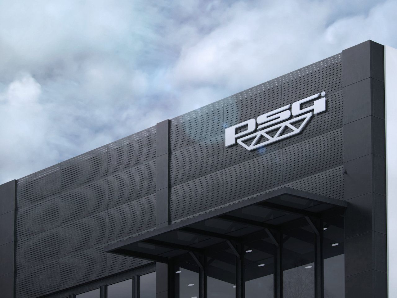
Complete Rebranding of the PSG Brand with an Extension to All Corners of this Construction Group. The new visual style respects and draws from the historical, original variant of the logo, in continuation of its redesign from the 1990s. The main objective of this change was to create harmony between the typographic part of the logo and the symbol in its lower portion. The individual segments, triangles, within the symbol were adjusted from the original 35° to 45°. This change, in the aspect ratio of the isosceles triangle, serves as the foundational design rule for creating the new visual style. While creating the new brand, it was important to respect historical continuity and, above all, to avoid causing confusion in the eyes of the public. The new brand is therefore crafted with humility towards tradition, while also allowing PSG the creative space for its fresh promotion within the marketing strategy.
Kompletní rebrand značky PSG s přesahem do všech zákoutí této stavební skupiny. Nový vizuální styl respektuje a čerpá z historické, původní, varianty logotypu v návaznosti na jeho redesign z devadesátých let. Hlavním cílem této změny bylo vytvořil soulad mezi typografickou částí logotypu a symbolu v jeho spodní části. Jednotlivé segmenty, trojúhelníky, v symbolu byly upraveny z původních 35° na 45°. Tato změna, poměru stran rovnoramenného trojúhelníku, slouží jako výchozí konstrukční pravidlo pro tvorbu nového vizuálního stylu. Při tvorbě nové značky bylo důležité respektovat historickou návaznost a především nezpůsobit zmatek v očích veřejnosti. Nová značka je proto tvořena s pokorou k tradici ale zároveň umožňuje společnosti PSG kreativní prostor pro její svěží propagaci v rámci marketingové strategie.
Client: Skupina PSG
Date: 2020
Designer: Michal Jakubec
Branding Stavení firma PSG Otrokovice